7

When I use font-lock faces that are bold, it messes up my auto-complete overlays so that they look like this:

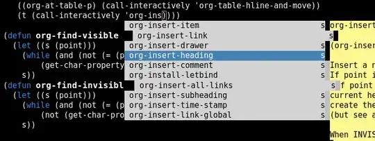
auto-complete overlay auto-complete overlay

One obvious solution to the problem would be to stop using bold fonts. But since I am using a color theme that I got from somewhere else, I would have to create my own version of it, and go through and manually remove any bold fonts. And if I decide to try a new theme next week, I will have to do the same thing over again.

Is there any way for auto-complete to adjust to account for bold font faces?

Assuming that this is a known limitation of auto-complete, I have a few alternate ideas. The problem is that I am not sure if any of them can be easily achieved (if at all):

  1. Disable bold faces in buffers where auto-complete is enabled
  2. Disable bold faces everywhere
  3. Use a font whose bold face is the same width as its normal face

As you can see, I'm okay with throwing out the bold faces if necessary, but I'm also interested in finding the easiest way to do it.

Malabarba
  • 22,878
  • 6
  • 78
  • 163
nispio
  • 8,175
  • 2
  • 35
  • 73

1 Answers1

6

This is really a limitation of Emacs' overlay system, upon which auto-complete and popup rely: the overlays are positioned using text column offsets, not pixels.

So your options are indeed as you outlined. The path of least resistance is to use a fixed-width font with a variety of styles. My personal favourite is Input Mono, FWIW.

sanityinc
  • 2,871
  • 13
  • 17
  • Did you have to do anything special to make Input Mono work in emacs? I just tried it (on Linux) and there is way too much horizontal spacing. I tried using Input Mono as my terminal font, and it works just fine. – nispio Oct 15 '14 at 20:28
  • @nispio I use Inconsolata (another monospace font) and they look great! – Kaushal Modi Oct 15 '14 at 21:04
  • @kaushalmodi Thanks but Inconsolata won't fix anything because it suffers from the same problem that my current font (DejaVu Sans Mono) has: The bold face is **wider** than the regular face. – nispio Oct 15 '14 at 21:50
  • 1
    Just try the condensed or ultra-condensed versions of Input: that's what I do. – sanityinc Oct 16 '14 at 07:40
  • I don't think that is the issue, because I can use the font successfully in the console, and it looks how I would expect it to. But iff I use it in GUI Emacs, there is a whole lot of extra space between the characters. – nispio Oct 21 '14 at 18:45
  • Try inspecting the text using `M-x describe-char` on the bold and regular characters, to see details of how Emacs is displaying them, and look for unexpected differences. – sanityinc Oct 22 '14 at 18:04